
SHAREHOLDER ENGAGEMENT PROJECT
BRAND & TEMPLATE DESIGN
Partnering with the Shareholder Engagement Project in 2024, I developed a visual brand identity designed to resonate with a cohort of foundations. The cohort functioned as a shareholder advocacy group, with experts focused on workers' rights, reproductive justice, indigenous rights, and climate/environmental justice.
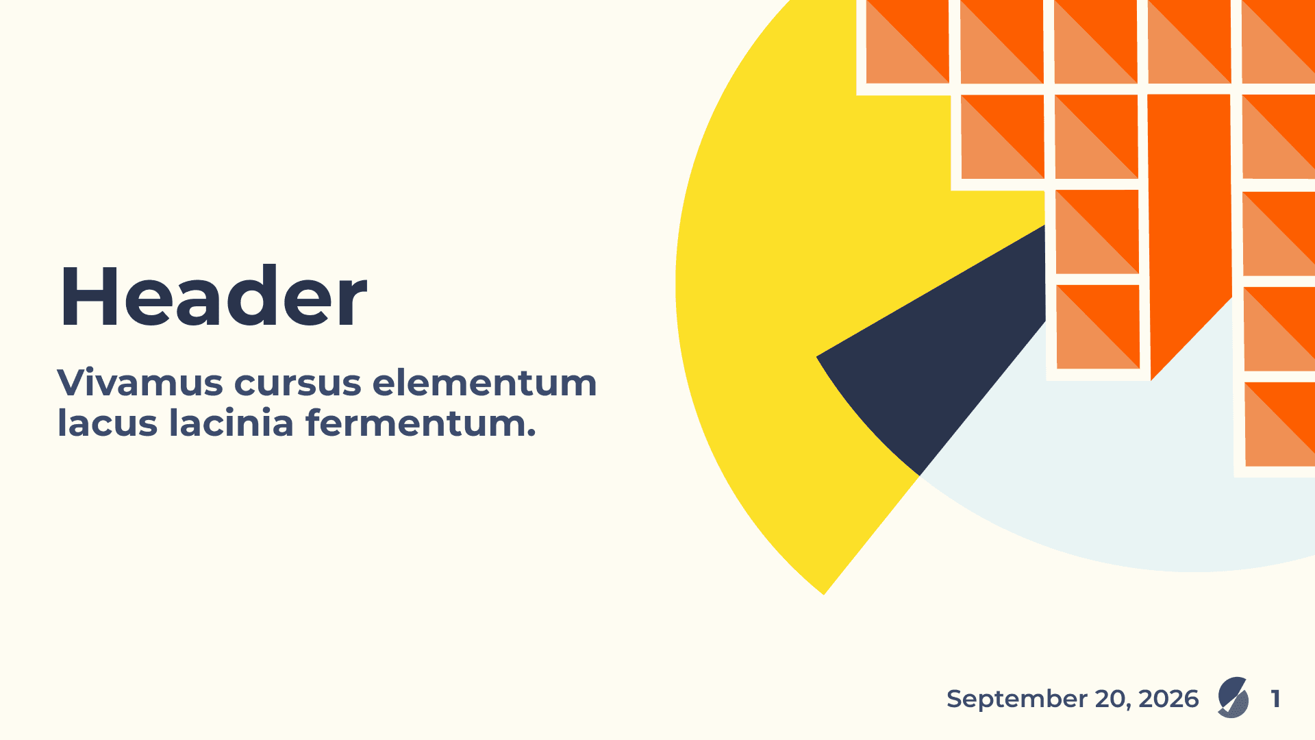
I wanted this brand to feel vibrant, while grounded, and to evoke a feeling of progress. The logo is a reimagined, deconstructed pie chart, representing the shareholders in the cohort. The pie-chart pieces overlap, showing the spirit of collaboration and quietly forming an arrow that is aimed upward, symbolizing progress. Within the negative space of the pie chart, you might also find a hidden check mark symbolizing choice and decision-making power.
SHAREHOLDER ENGAGEMENT PROJECT
BRAND & TEMPLATE DESIGN
Common Future is an organization operating at the cross-section of racial and economic justice. The organization does this through equitable loans and back-office support. An accelerator that invests in a cohort of 10 BIPOC women- and non-binary-led organizations that are actively working to dismantle economic inequality. And last, through influence work in policy spaces and through thought leadership in research and strategic communications.
Working with Common Future has allowed me to build a visual identity from the inside out. When I first started at Common Future, we explored how design could further represent the brand's personality and character through imagery and color. We wanted the brand to feel alive and authentic. We did this by incorporating organic and complex elements and textures. We also intentionally played up the colors ‘gold’ and ‘green’ to subconsciously signal money or wealth.
SHAREHOLDER ENGAGEMENT PROJECT
BRAND & TEMPLATE DESIGN
Partnering with the Shareholder Engagement Project in 2024, I developed a visual brand identity designed to resonate with a cohort of foundations. The cohort functioned as a shareholder advocacy group, with experts focused on workers' rights, reproductive justice, indigenous rights, and climate/environmental justice.
I wanted this brand to feel vibrant, while grounded, and to evoke a feeling of progress. The logo is a reimagined, deconstructed pie chart, representing the shareholders in the cohort. The pie-chart pieces overlap, showing the spirit of collaboration and quietly forming an arrow that is aimed upward, symbolizing progress. Within the negative space of the pie chart, you might also find a hidden check mark symbolizing choice and decision-making power.
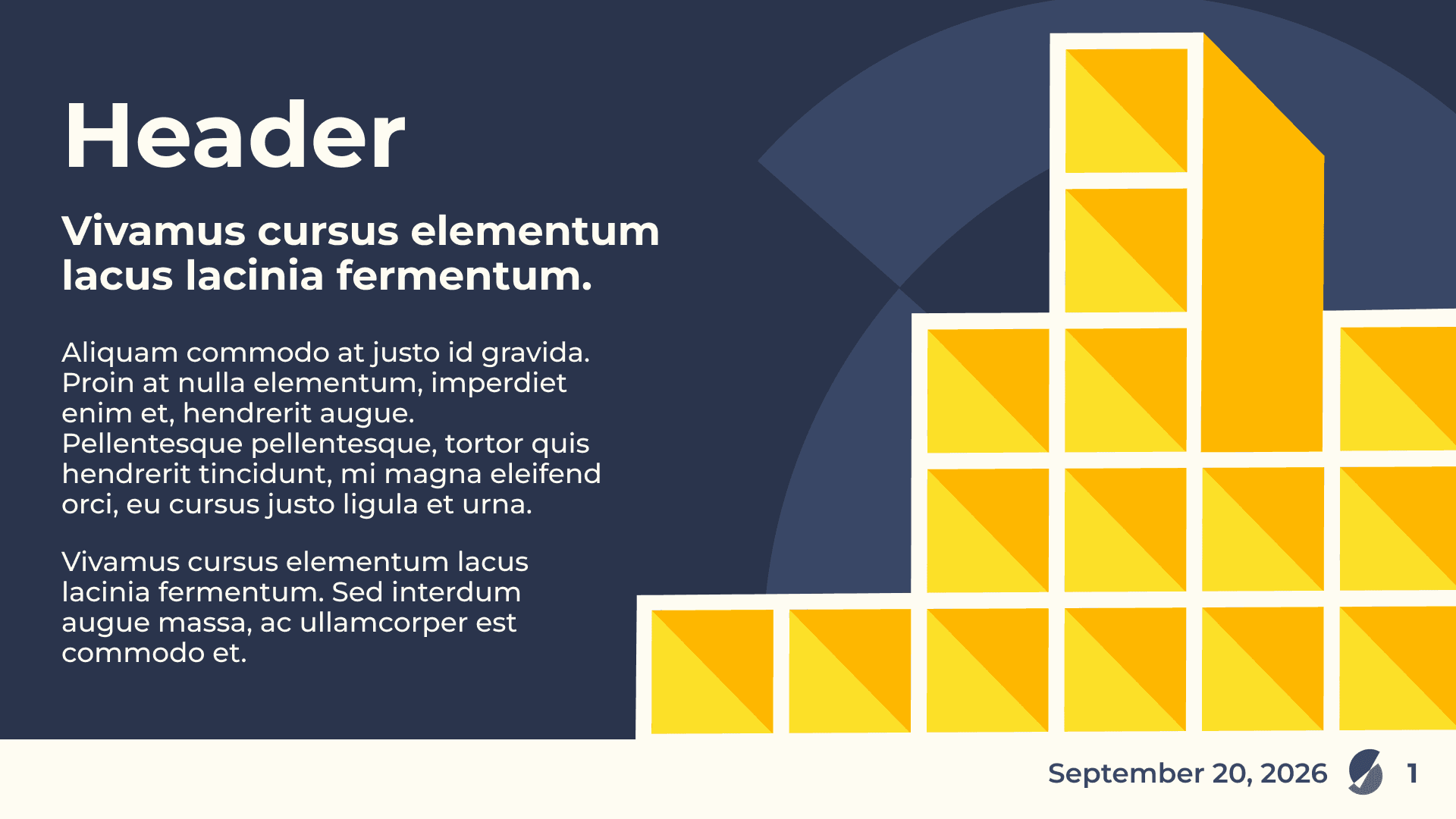
In 2026, I revisited this project to create a series of refreshed brand assets. I expanded upon the initial graph/chart motif by creating a variety of dimensional bar graphs. We wanted to show that the cohort was evolving and growing in complexity, and also reflect the new challenges that these foundations faced. Most importantly, I wanted to communicate the strength and perseverance of the foundations; that this was a long game marked with ups and downs.





Let's work together!
Let's work together!
Let's work together!